WAYFINDING ‧ SIGNAGE DESIGN ‧ ENVIRONMENTAL DESIGN
Venice is one of the last great cities of the world. It is also one of the hardest to navigate.
This proposal calls for a comprehensive overhaul of Venice’s signage and navigational elements to make it more welcoming and accessible to all.
Vaporetto map
The design system centres around a newly simplified vaporetto service map. Venice’s famous waterbuses currently use a convoluted service design that is quite challenging for tourists.
Using a trunk-style system (like New York’s MTA), common destinations can be reached easily from a variety of service lines.
Lines are grouped by colour but remain accessible to the vision-impaired by their initial letters.
Strip maps (right) provide quick transfer information at stations and on waterbuses themselves. For boats travelling along the Grand Canal, passengers can also see the bank along which each stop is located.

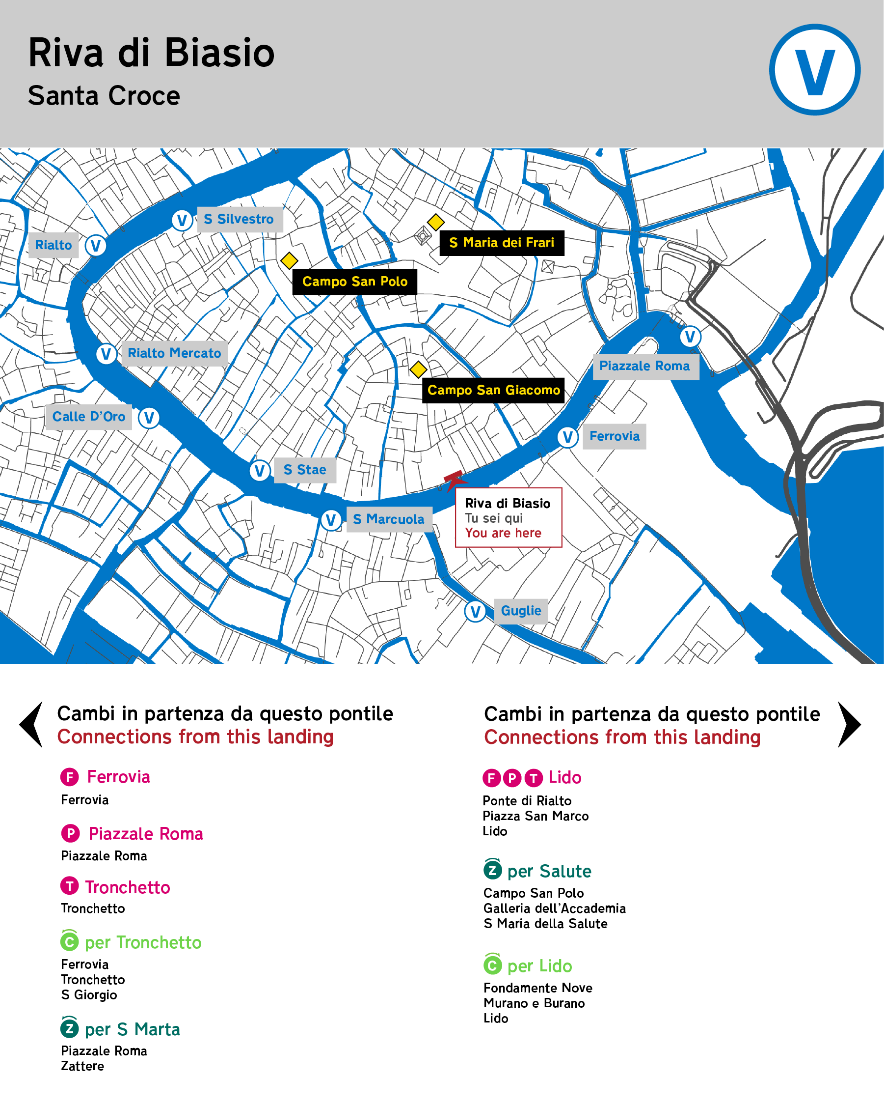
Plinth maps
Larger plinth maps at station entrances (below) provide a simple, customized system view along with a list of common destinations.
Circular routes (such as the C line encircling the main archipelago) are indicated by their midpoint terminus depending on the direction of travel.
The reverse side, for passengers disembarking the waterbus to enter the city, shows a summary map of the area, including landmarks and other nearby transit options.

Bersagli
For Venice’s winding alleys, these radar-style signs provide a rough bearing and nearby attractions, along with local transit connections.
There are hundreds of paths between any two points in Venice. This system, especially in the use of bersagli, encourages spatial understanding of the locale, rather than linear and prescriptive directions.


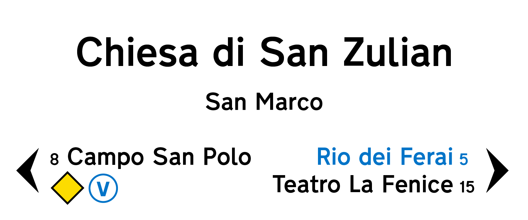
The Yellow Line
These signs point to popular attractions throughout the city, but they can be confusing.
No more double-sided arrows that do more to mystify tourists than help them.


New signs for the Yellow Line provide more density and clarity, while continuing the diamond iconography found throughout the rest of the system. As with other sign types, approximate walking times are provided to give a sense of relative distance.
Nizioleti
Similarly, Venice’s famous ‘bedsheet’ signs, or nizioleti, are widely-used but lack a clear and helpful structure.


Compared to the existing signage, the new nizioleti accommodate more usable information and provide important consistency with other sign types to increase trust in the design system.
Nearby attractions and transit connections are provided, and larger and more developed canals are signposted.