Project Brief
Budd Radon Services, a small business based in Ottawa, reached out looking for a branding package that would be informative, clean, and modular, as they look towards expanding into future product lines and services.
What is radon?
First, I wanted to create a series of explainers for customers to understand the dangers of radon and the advantages of testing and mitigation services.
This was also a good way to educate myself on the science behind radon and its dangers. A good visual system is rooted in the underlying truth of what it’s conveying.
The elephant in the room: radiation
How do we talk about radiation in a calm but clear way? Radon can cause serious health issues, but we don’t want potential customers to feel negative emotions when considering the client’s services.
One major hurdle to get over in this respect is iconography. Society has established a visual language for radiation that is inherently scary, and with good reason. It is scary. But in this case, it’s manageable.
In other cases, it’s less manageable — ever heard of raycats? Semioticians have spent many years discussing how we might communicate the idea of radiation to future occupants of Earth.
We won’t be needing these ideas here, but it does raise the question: how do we communicate radiation without using any of its existing visual iconography?
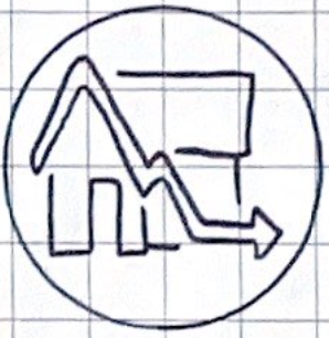
Gradually, many iterations of sketches began to produce an overarching theme: a basic house shaped interrupted by or composed of particle lines. This would become the foundation of the logo for the radon services brand, but how would this conform with the larger brand?
The umbrella brand
From the beginning, this logo was intended to be the first launched service of many. By setting this up early and anticipating future service lines, we were able to produce a flexible brand system that can be adapted, extended, reused, and remixed.
This also means that services that would ordinarily be starting from scratch have a huge headstart on the competition from existing brand equity, as well as a well-defined style guide and a better chance of cross-selling services with each other.
The client and I bounced a lot of ideas back and forth as we zeroed in on a flexible visual system. What became clear was that a short, catchy name full of symmetrical glyphs (b and d) lended itself to a big, bold brand with lots of visual real estate to work on.
Our approach
Our final approach focuses on a single distinct element, serving as both logo and canvas: the upper-case B.
Composed of just circles and rounded rectangular forms, the B crest harmonizes well with circular logos.
The Radon Services logo takes a geometric house shape and intercuts it with lines showing the evacuation of sitting particles from a home. The upward, circular rushing of the lines provides visual conversation with the B shield it’s placed on, while the arrow promises a job well done.
The logo itself relies on evenly spaced, equally thick lines, all converging on a series of concentric circles, radiating out from the centre of the B shield.
This wireframe highlights the somewhat awkward convergence of the upper and lower bowls of the B. What reads best optically isn’t always the cleanest option formally.
Looking ahead to the wider brand system, an early concept logo for an electrical service offering would employ a similarly concentric approach and identical line weights, once again portraying an abstract interpretation of the service in a familiar environment.
A restrained, basic colour palette and a friendly, low-contrast typeface complement our brand goals: approachability, value, and honesty.
The logomark works well at multiple resolutions, and generous negative space in most applications gives the mark a balanced and polished feel.
This was an incredibly fun project to work on, and one that I’m excited to develop over the coming years with a great client.
Check out Budd Radon Services here.


